Powargrid
  • Home
  • Blog
  • Buy
  • Demo
  • Media
  • Press
  • The Daily Blobbie
  • Blobbie Meme Maker
  • Forums

Web player screen resolution

11/9/2012

2 Comments

 
Commander Grak Gives You The Eye
Hi everyone! My turn to write something on this here interblag, and, since I'm me, it'll be a little techy: we're gonna talk screen resolutions.

This story started when one of our friends suffered through our game while having to scroll up and down continuously, because the web player window was too big for her laptop screen. Unfortunately, our budget does not currently allow us to solve this problem by sending everyone free giant monitors, so I spent some time making sure our game looks good at a variety of screen resolutions. In general, this comes down to three things:
  • Deciding on a minimum supported resolution
  • Making sure everything fits at this minimum
  • Gracefully handling higher resolutions, and if possible, lower ones as well
To decide on what minimum resolution we would/could support, we had a look at the very handy Steam Hardware Survey. Here, we found that 1024x768 and 1366x768 together make up over 20% of the machines on Steam, so we decided that 1024x768 would be a good minimum resolution to target.
Picture
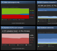
Fitting everything in wasn't too bad, if a tight fit for some dialog boxes. And hey, limitations breed creativity, so it's good to restrict Willem in how much text he can throw at you in a single screen ;-) If your screen is bigger, the dialog boxes won't fill as much of the screen, and if it's wider, you get to see a bit more of the scenery.
By default, Unity's web player plugin is set to a fixed size. For small monitors, this may be too large, so you're forced to scroll your browser window up and down to see the whole game, as was the case for our friend. If you have a huge monitor, it'll fit, but you're looking at a postcard sized game in the middle of a sea of nothingness. It was easy enough to switch that to a relative size - now the web player always takes up the full browser window. If your monitor meets our minimum supported resolution, all will be well, right?
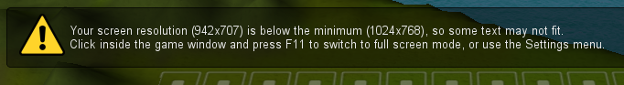
Well... There was one oversight: your browser also takes up some space with its title bar, address bar, etc. Not a problem for big screens, but small screens really need all the space they can get. However, we don't want to force the game into full screen, so the game just shows you a warning if the window ends up smaller than the recommended minimum.
Picture
Full screen mode
Upon adding the full screen mode, we ran into another, unrelated problem: it would use a much lower resolution than your screen could support. This thread over at answers.unity3d.com had the answer: when switched to full screen, the web player chooses its resolution by picking the smallest of these:
  • your native screen size
  • the size set in your build settings for the standalone build
It's rather counter intuitive that the web player would be dependent on the standalone build's settings, but there you go. The quick and dirty fix, then, was to set the standalone build to some outrageously high resolution, like 8000x6000. That way, the web player always switches to your primary display's native resolution - exactly what we want!
Failing gracefully
So what if someone still tries to play the game at a lower resolution? After deciding on a minimum resolution, I had set a fixed height for the dialog windows, which caused a really bad layout problem on lower resolution screens: the dialog reply buttons would fall off the screen, leaving the player with no clue they could even do anything, effectively killing the game for them at the start of the first mission. Now, if you play the game on a low resolution screen, the game will squish everything into the available height, so you can at least see what's going on.
There you go - my first blog post! A bit on the overly detailed side, but maybe the information will come in handy for someone. Not sure what I'll write about next - I'm mostly inclined to talk about the technical/coding aspects of Powargrid, so let me know if there's anything you're interested in!

Happy hacking,
Michiel

2 Comments

System design

3/9/2012

0 Comments

 
As promised, we'll take a closer look at Powargrid now. I assume that you're familiar with the rules as they are now (if not, you can play the game or have a look on our about page), so this post is about the way the game system grew. As a game designer, I think that's interesting and I hope you agree :).

I started off design with three types of buildings; power plants to produce power, power lines to transport it and towers to shoot other buildings. The objective was to destroy your opponent's power plants and you were constrained by the amount of power you produced. We tested the game in one evening and it showed enough promise to start development.

Soon though, we noticed that we often didn't use up all our power, or that we used it on things we didn't need. So we added the power storage. The added advantage of this was that players could save up to do something big, like an attack rush or building a power plant. The power storage also is a power source, which means they can power your attacks even if the line to your power plants is cut off.

The next thing we ran into was that the player who took the first turn had a big advantage over the other player. And while it's impossible to fully equalise the start for both players, this was too big a difference. Our solution was to make power plants ramp up slowly, so they now take five turns to reach their max output. This also fixed the problem that building an extra power plant was too much of a sudden advantage.

But even with that adjustment, we found that rushing your enemy quickly became a dominant strategy for all players. Compensating for that was quite counter-intuitive. Mostly, you want to stimulate attack, to prevent the game from becoming stale. But we needed to reward players who were willing to think their attacks through some more. So we added a penalty for building more than two squares from a power plant or a storage.

And then there were two things we decided not to do. First, we did not decrease the power penalty if multiple power lines lead to one point. There were too many special cases to make that mechanic intuitive enough to use. The second, much tougher, decision was not to divide the available power if a player's grid has multiple parts with power sources. So you can use all your power at any point connected to a power plant or power storage, even though this is counterintuitive for many players when they first play Powargrid. Dividing the power would require a lot of extra mental bookkeeping and a lot of extra unfun actions for players, mainly because you'd have to assign all leftover power to separate storages at the end of a turn. And that runs against our wish to make the game mostly about tactics and to keep it as simple as possible. So we chose a slightly steeper learning curve instead of a mechanic that would keep on bothering people every time they play.

After that, we introduced another building to the game: the lightning cannon. We were reluctant to do so, since we want to minimise the base complexity of the game, while maximising the emergent complexity. However, we decided that a different option for shooting was needed to keep the game varied and interesting. It turned out to be a good way to reach through defences and damage power plants from afar.

With all that, there was one last issue to tackle. With the higher build cost with distance from power sources, the game ended up in a stalemate too easily (quite a seesaw experience). Michiel came with the solution: overcharge, which doubles a power plant's output, but also damages it each turn. It can't be turned off, so you lose that power plant eventually. Overcharge is good for sudden attacks and last ditch defence efforts. This adds a nice element of unpredictability. We knew this was the right track when we realised how much complexity overcharge added to AI design. Both deciding when to overcharge and taking into account that your opponent can do the same is hard. But more on AIs in a later post.

That sums up the system design for Powargrid. It's been quite a struggle to create both intuitive and easy to learn gameplay and enough emergent complexity to keep the game interesting in the long run. We think we succeeded, but we'd love to hear your opinion on the matter.

Thanks for reading. Next time, I'll discuss the look of the game. Or maybe Michiel will have some things to say... In the meantime, check out the new build. It's got music and multiplayer!

-Willem-
0 Comments

    Author

    We're Michiel and Willem. Hi!
    This blog is about the development of Powargrid and our experiences in doing so.

    Archives

    June 2017
    May 2017
    November 2016
    October 2016
    September 2016
    July 2016
    May 2016
    April 2016
    March 2016
    February 2016
    January 2016
    October 2015
    September 2015
    August 2015
    July 2015
    June 2015
    May 2015
    March 2015
    January 2015
    December 2014
    November 2014
    October 2014
    September 2014
    July 2014
    June 2014
    May 2014
    April 2014
    March 2014
    February 2014
    January 2014
    December 2013
    November 2013
    October 2013
    September 2013
    September 2012
    August 2012

    Categories

    All
    Game Design
    Marketing
    Progress
    Slacking
    Tech

    RSS Feed

© Wee Free Studio | Steam | Twitter | Facebook | RSS feed | Press | Contact